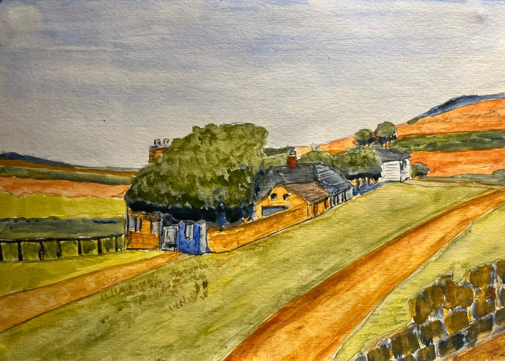

After an earlier version of this that could best be described as ‘muddy,’ I realised what that version lacked was colour contrast, or colours that drew the interest. If you look at the picture on the right, by John Nash (1893-1977), not only is the eye drawn into the picture by the path alongside the hedge and past the tree, there is a variety of landscape shapes and colours. Note the blue in the distance – those ‘blue remembered hills’ really were. And that roller in the left foreground adds balance to the blue in the top right.

So armed with a thought of ‘why does this picture by John Nash engage the interest while my picture of Cleeve is a muddy mess?’ I rethought it. Exaggerating the features of the landscape was one way – the hills are now more rolling (at that point on Cleeve you’re near the top and the highest point is to your right, not ahead of you). Then add to the colours – imagine contrast where it doesn’t exist.
I hope this is a way to improve.

Leave a comment